Patrice Dillard
Creative Design Portfolio

About
👋 Hi! My name is Patrice, I'm a multi-disciplined Artist experienced in various mediums including Product Design, Graphic Design, and Web Design/Development. Fluent in the following coding languages HTML, CSS and Javascript.
Case Studies

Improving a Call Center CRM's Efficiency
View
Ease of Use for a Patient Survey Application
View
Revitalizing a Brand
View
Graphic Design


Redesigning a Fresh Meal Delivery Website
Role: Research, Strategy, Development
Employer: Synechron
Platforms: Web, Mobile
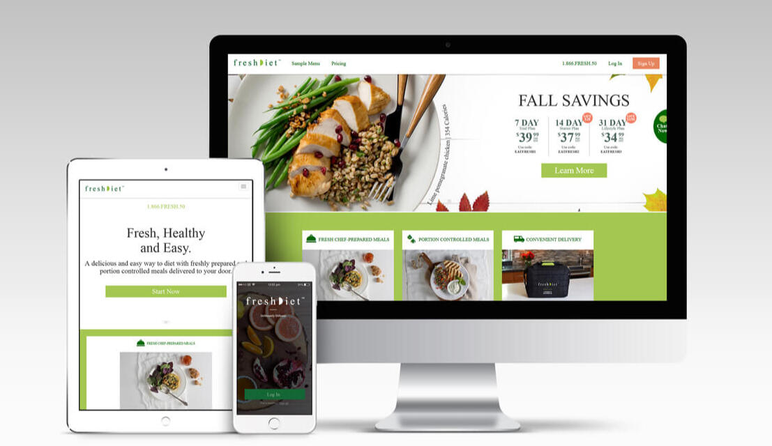
Background
The fresh meal company wanted to increase sign-ups and broaden their appeal across a wide range of customers, from busy professionals to families, students, and people with dietary needs or disabilities. The existing website had outdated UI and a clunky delivery scheduler that led to cart abandonment and poor retention. A key challenge was designing a scheduling system that was flexible enough to support a variety of lifestyles while still feeling effortless and intuitive for all users.
Discovery & Research
The primary goal of my research phase was to understand what motivated different types of users to choose a meal delivery service and to uncover the pain points that were preventing them from converting or staying engaged. By learning from both existing users and competitors, the focus was to identify opportunities to simplify the ordering experience, especially the scheduling process, while ensuring the platform could support a broad range of lifestyles and needs.
Competitor Analysis of Top Brands
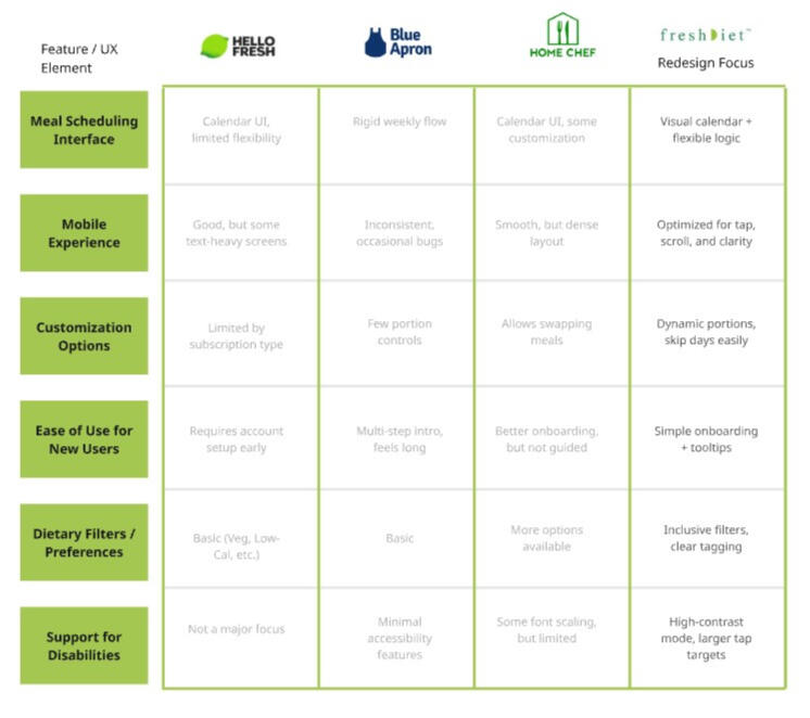
Competitor Analysis
As part of the discovery phase, I conducted a detailed competitor analysis, focusing particularly on leading meal kit brands that were dominating the market. This included companies like HelloFresh, Blue Apron, and Home Chef. I analyzed their user flows, homepage messaging, pricing models, and, most importantly, their meal scheduling experiences. These insights helped shape opportunities for differentiation, allowing us to prioritize simplicity, flexibility, and inclusive design in our own scheduling experience.
Surveyed existing users to understand why they canceled or didn’t convert
To understand barriers to adoption and retention, we conducted a survey with existing and former users, specifically targeting those who had either canceled their subscription or abandoned their sign-up mid-flow. Through these conversations, several key themes emerged. Many users found the sign-up and scheduling process confusing or too time-consuming, especially when they were trying to quickly check if the service fit their routine. Others felt overwhelmed by the number of decisions they had to make upfront, such as meal selection, portion size, and delivery days, without fully understanding how the service worked.
Key Takeaways:
Too Many Steps UpfrontUsers felt overwhelmed by having to make multiple decisions (meals, delivery, portions) before understanding how the service worked.
Confusing Scheduling FlowThe meal delivery scheduler lacked clarity and flexibility, causing frustration, especially for users with irregular routines.
Lack of FlexibilityUsers wanted to easily skip weeks, change delivery days, or modify preferences without penalties or complicated steps.
Poor First-Time ExperienceMany users didn’t feel guided through the onboarding process, leading to confusion and early drop-off.
Unclear Value PropositionSome users weren’t sure what made this service different from competitors or worth the commitment.
Mapping out pain points in the sign-up flow and scheduler experience informed our goal of simplifying the process and building a more forgiving, intuitive scheduler that respected users’ time and adapted to their needs.
Strategy & Design Approach
• Simplified the entire ordering journey: from meal selection to scheduling and payment.
Why: The original flow caused users to drop off due to decision fatigue and unclear steps. Streamlining the process helped reduce friction and made the experience feel more manageable and inviting, especially for first-time users.
• Created UI patterns that worked well across mobile and desktop.
Why: Many users accessed the platform on mobile during commutes or quick breaks. Ensuring a seamless mobile experience was key to supporting conversions and long-term engagement across devices.
• Introduced onboarding tips and guided steps to support first-time users.
Why: Interviews revealed confusion during sign-up and a lack of clarity about what the service offered. Onboarding guidance helped users feel supported and reduced drop-off during account creation and first order setup.
• Designed a modular, visual delivery scheduler that made it easy to plan meals weekly or skip certain days.
Why: Users wanted more control over when meals arrived, but the old scheduler was rigid and hard to use. A calendar-style interface allowed for better at-a-glance planning, while modularity made the system adaptable for various routines.
Outcomes & Impact
Reflection
This project was a strong reminder of how clarity in UI can directly impact conversion. It also reinforced the value of prototyping complex flows early. The scheduler went through multiple iterations, but testing with real users helped us strip away friction without losing functionality. It was a great example of how thoughtful design supports business growth without compromising user experience.
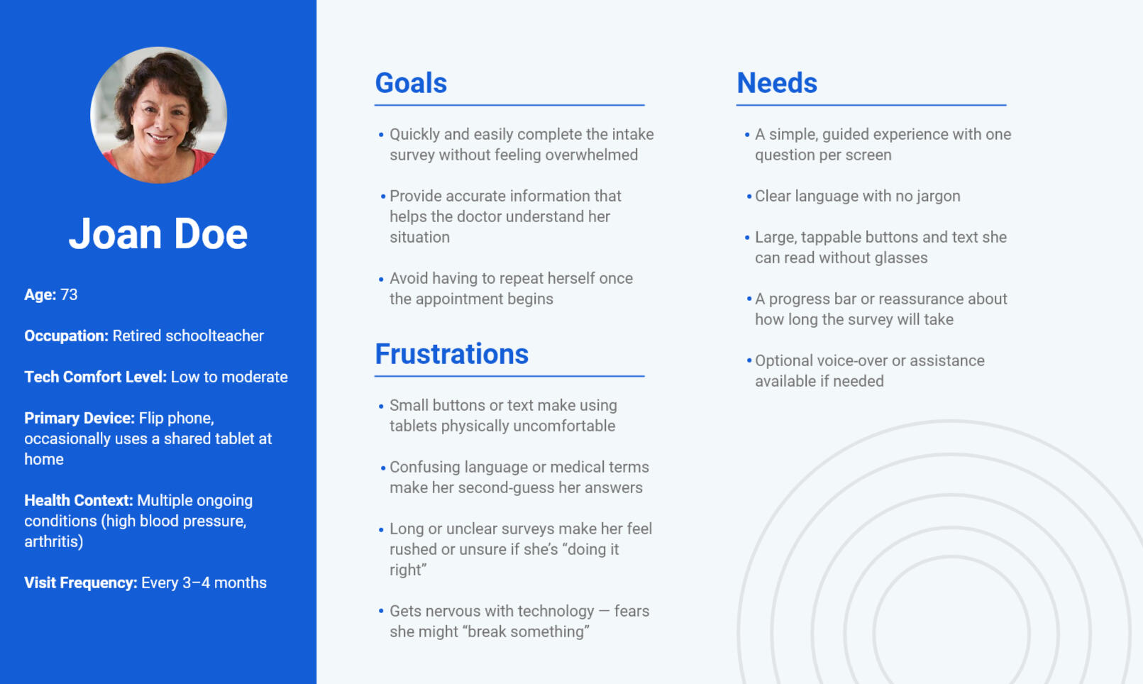
Patient Survey Application for In-Office Tablets
Role: Research, Strategy, Development
Employer: Vohra
Platforms: Mobile Tablet
Background
Doctors needed a simple, effective way to collect basic health and lifestyle information from patients during visits, ideally before the consultation began. The existing intake process relied heavily on rushed conversations or paper forms, often leading to incomplete or inconsistent patient profiles. The challenge was to create a digital survey experience that would be approachable for elderly users while capturing enough useful data for doctors to make informed decisions.
Discovery & Research
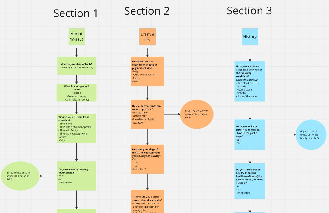
To better understand the needs of both patients and physicians, I began by conducting contextual inquiries and interview sessions with medical staff. Doctors shared that they often struggled with inconsistent or incomplete patient information at the start of appointments, which impacted their ability to provide efficient care. Through collaborative sessions, we worked together to prioritize the most relevant categories of information, including lifestyle habits, current medications, pain levels, and recent medical history. That information would help build a useful baseline profile for new or returning patients.Given that many patients using the survey would be older adults, I also conducted informal interviews and observation sessions with elderly patients to assess their comfort with touchscreen devices. This research revealed several key usability concerns: many participants were unfamiliar with tablet interactions, experienced difficulty reading small text, and found long, dense forms intimidating. These insights guided our approach, including the need for larger buttons, simpler language, and a sense of progress throughout the survey. Ultimately, the research reinforced how important it was to design a survey experience that felt approachable, respectful of patients’ time, and flexible enough to adapt based on the individual’s answers.Key Findings:
Elderly users preferred vertical layoutsIdeally one question per screen, avoiding overwhelming blocks of content.
Friendly, conversational languageUsing friendly, conversational language increased engagement: e.g.. “Do you take any medications?” performed better than “Current prescriptions.”
Shorter and concise is betterA 5-minute completion threshold significantly reduced drop-offs.
Making ProgressPatients appreciated progress indicators that clearly showed how far along they were and how much was left.
Persona Development
Strategy & Design Approach
• Prioritized large touch targets and minimal scrolling to support motor and visual limitations.
Why: Older adults may have issues with fine motor control or vision. Large buttons, plenty of spacing, and a scroll-light design helped improve accessibility and reduced input errors.

All button choices were set further apart, used full width and were color coded.
• Suggested using plain language and eliminating medical jargon where possible.
Why: Many users were not familiar with technical or clinical terminology. Using simple, conversational language helped patients understand what was being asked, increasing both confidence and accuracy in their responses.
Question organization and logic based on Doctor interviews
• Recommended breaking the survey into bite-sized, category-based sections with clear progress indicators.
Why: This helped reduce cognitive overload and made the experience feel more manageable, especially for elderly patients who may tire easily or become confused by long, continuous forms.
Screenshots from Prototype

Demonstration of Large buttons, Large input fields

category-based sections with clear progress indicators


• Prioritized large touch targets and minimal scrolling to support motor and visual limitations.
Why: Older adults may have issues with fine motor control or vision. Large buttons, plenty of spacing, and a scroll-light design helped improve accessibility and reduced input errors.
• Advocated for skipping logic to shorten the experience when certain answers made follow-ups irrelevant.
Why: This made the survey feel smarter and more personalized, reducing fatigue and helping ensure patients only saw questions that applied to them.
Outcomes & Impact
Reflection
This project emphasized the importance of designing with empathy, especially when working with vulnerable or less tech-savvy users. It also highlighted how critical research is in influencing both what we build and how we build it, especially when balancing multiple stakeholder needs.
CRM Redesign for Dental Plan Call Center
Role: Research, Strategy, Design, Development
Employer: Dentalplans.com
Platforms: Web
Background
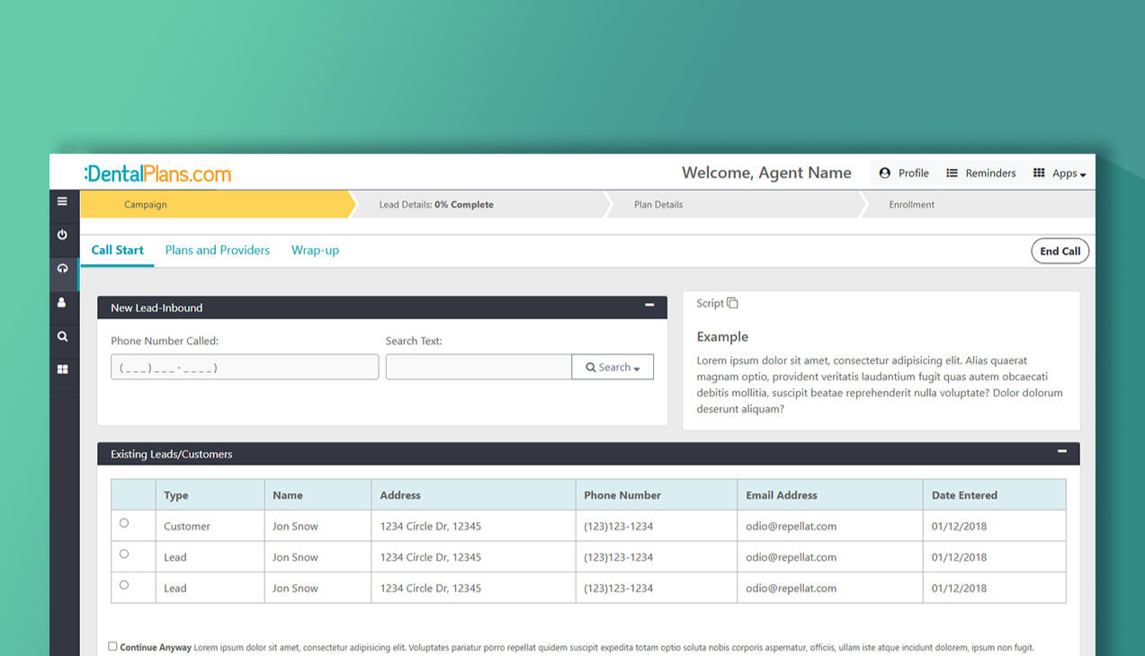
The existing CRM used by call center agents selling dental savings plans was outdated, unintuitive, and misaligned with how agents actually conducted their calls. It forced users to jump between disconnected screens, search for scattered data, and input information in ways that disrupted the natural rhythm of a conversation. This led to slower calls, higher error rates, and increased frustration across the team.A major gap in the old interface was the lack of visibility and priority given to lead collection, which is vital for follow-ups and long-term conversions. Agents often had to go out of their way to record or retrieve lead information, leading to missed opportunities and inconsistent data. Our challenge was to redesign the CRM experience to mirror the real-world flow of a call while ensuring that essential actions like lead capture were intuitive, accessible, and seamlessly integrated into every agent’s workflow.
Discovery & Research
• Interviewed agents across multiple roles to understand pain points in daily use. During this process identified four primary agent roles with distinct use cases and goals (New Sales, Renewals, Retention, Member care).• Shadowed live calls to observe workflows in real-time.• Conducted breakout sessions with top-performing agents to gather data on the tactics and patterns that led to successful sales. This helped identify which features and flows directly supported performance.
Key Findings:
Agents follow a call-first mental modelAgents think and work in the rhythm of a conversation, not in terms of static forms. The existing CRM forced them to jump ahead or backtrack, causing cognitive overload.
Different agent roles = different needs
• New Sales Agents needed quick access to plan details, pricing, and enrollment workflows.• Renewal Agents required streamlined account lookup and history review for faster repeat enrollments.• Member Care Agents focused more on resolving account issues and answering benefit-related questions.• Retention Agents prioritized understanding cancellation reasons and offering targeted retention solutions.• A one-size-fits-all interface created friction, as each role had different priorities during calls.
Top performers used consistent behavioral patternsThrough breakout sessions with high-performing agents, we uncovered repeatable strategies: prioritizing rapport-building early in the call, using specific phrasing during enrollment, and relying heavily on quick-glance info like plan benefits and pricing tiers.
Lead collection was treated as an afterthoughtCritical sales leads were often buried in the UI or placed at the end of the workflow. Agents either skipped it or forgot, resulting in lost opportunities and incomplete follow-up data.
Information overload at key momentsDuring enrollment, agents were presented with too many input fields and non-essential data. This slowed them down and increased the risk of input errors, especially under pressure.
Training relied on workarounds, not the systemNew hires were often taught “hacks” or unofficial ways to navigate the CRM faster. This pointed to UX failures being compensated for socially, not structurally.
Strategy
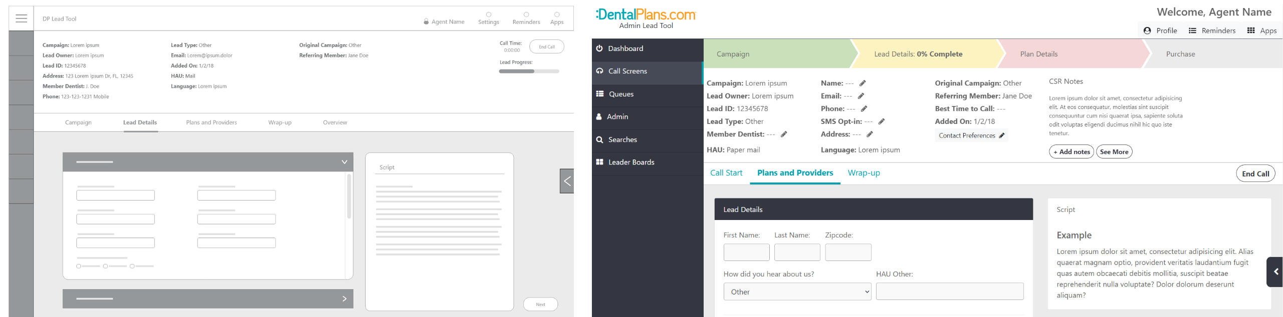
Our strategy was to realign the CRM interface with the natural structure of a sales call, allowing agents to move fluidly through their conversations without needing to hunt for information or jump between screens. We introduced a modular layout that could dynamically adapt based on the current needs in the flow, for example, grouping related inputs into collapsible sections that are surfaced as needed. Throughout the process, we focused on clarity, speed, and minimizing the number of clicks and cognitive load. The design system was also built with reusability in mind, making it easier for developers to implement variations of the interface based on user role and call type.
Design & Iteration
• Created low-fidelity wireframes to test layout concepts early with agents to gather feedback.• Prototyped in Adobe XD with simulated call scenarios.• Used component-based design so dev team could implement role-specific versions efficiently.
• Balanced clarity and flexibility, minimized visible fields but made deep data accessible on-demand.

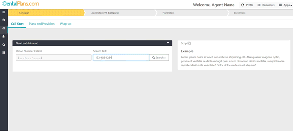
I designed a retractable menu tray that allowed Agents to perform essential tasks when needed at any point in the process without taking up important screen real-estate.
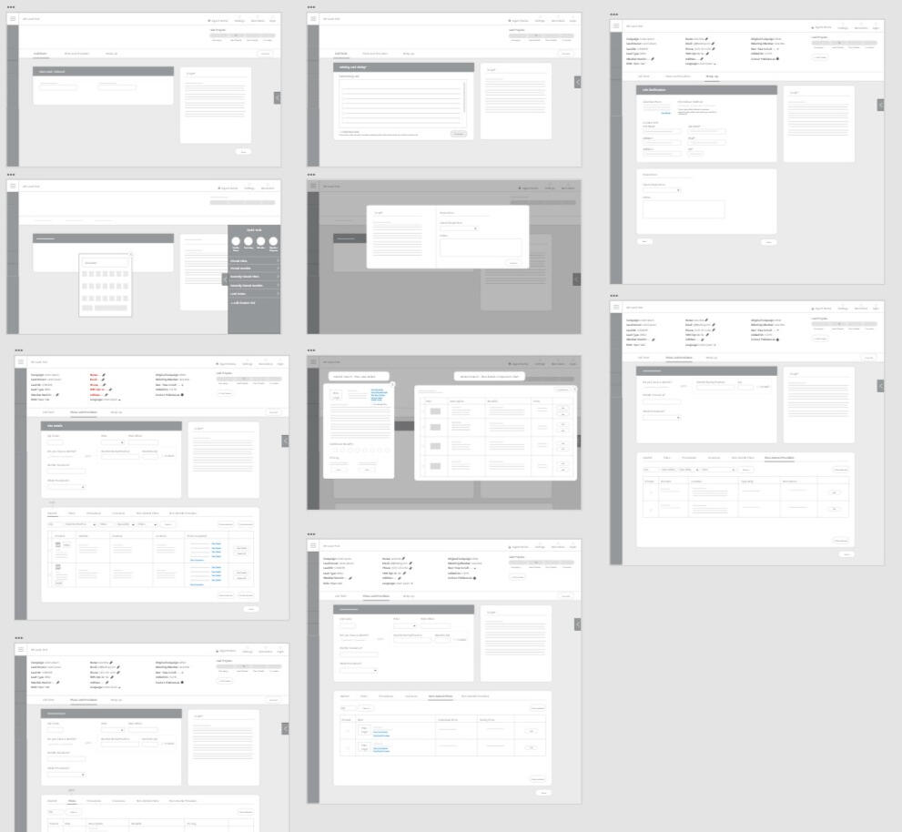
Low-fidelity wireframes
Many key changes developed overtime as the project progressed through user breakout sessions with the call center management and the agent team. Posted below are side-by-side comparisons of where the wireframes started to where they ended as a final mock-up concept. A few key updates were the importance of the progress bar, addition of more persistent data inputs and more concise sections for each phase of the calls.
Style Guide
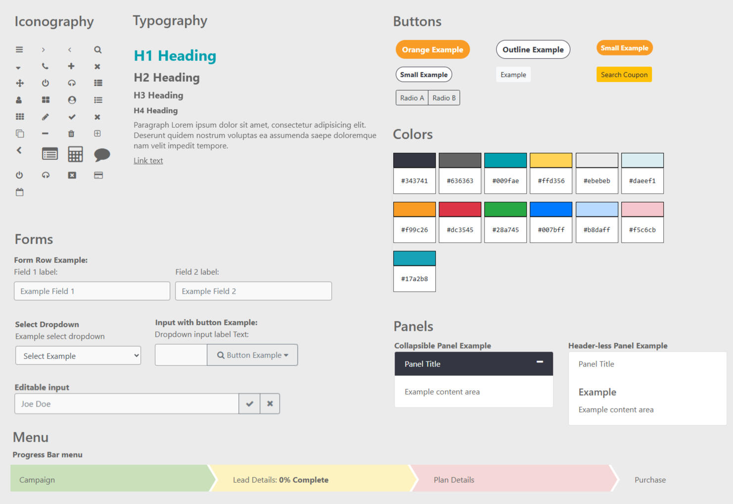
In addition to visual guides, front-end code snippets were provided to ensure optimal implementation.
The Testing & Feedback Loop
• Ran usability sessions with live data scenarios.• Iterated layouts to reduce number of clicks and eliminate unnecessary steps.• Agents reported smoother flow and little to no reliance on their own notes and hacks to use the system.• Incorporated real-time feedback from QA and Sales Ops teams.
Outcomes & Impact
Reflection
This project reinforced how critical role-based UX is in enterprise tools. A generic interface can easily become a blocker in high-pressure, high-volume environments like call centers. The sequence of UI elements should mirror real-world mental models, in this case, the natural rhythm of a sales call. Designing with that conversational flow in mind made the interface feel more intuitive, allowing agents to stay focused on the customer rather than the tool. Overall, this project highlighted the power of empathetic design in high-stress work environments, and the importance of balancing structure with flexibility.If I had more time, I would have:
Conducted testing post-launch to measure the CRM’s impact over time, especially on new hire ramp-up and retention.
Worked with engineering to build a performance dashboard that helps agents track their own success patterns (mirroring our research with top performers).
Piloted in-app coaching or contextual tooltips to support less experienced agents in real time.
Employer:
Dentalplans.com
Summary: Designed search directory with a focus on usability and mobile compatibility.
I was responsible for design, prototyping and Front-end development using the following technologies: Html, Css, Bootstrap, Adobe XD.


Logo design iterations for Dentists.org branding.

Employer:
Dentalplans.com
Summary:Designed marketing site with a focus on usability and mobile compatibility.
I was responsible for design, prototyping and Front-end development using the following technologies: Html, Css, Bootstrap, Wordpress, Adobe XD.


Employer:
Dentalplans.com
Summary:Designed complex interfaces such as Chat dashboards with a focus on comprehensive flow and usability. I was responsible for the design, prototyping and Front-end development using the following technologies: Html, css, Bootstrap, Photoshop, Adobe XD.

Employer:Vkidz, Inc
Summary:Redesigned teacher dashboards with a focus comprehensive flow and usability.
I was responsible for design, prototyping and Front-end development using the following technologies: Html, Sass, Bootstrap, Photoshop, Illustrator, Principle.


Employer:
Dentalplans.com
Summary:Designed social media content for rebranded campaigns. Tools used: Illustrator and Photoshop

Employer:
Dentalplans.com
Summary:Designed and prepared branded products for special event. Programs used: Illustrator


Employer:
Dentalplans.com
Summary:Graphic design for promotional site banners and ads. Programs used: Illustrator, Photoshop


Freelance projects
Vivid Decor
Logo design for a home decorating agency using the following technologies: Photoshop, Illustrator.

Le Petite
Design and branding aimed at creating a modern clean cute aesthetic. Programs: Photoshop, Illustrator.


Hackslash
Design and branding for a sponsored college event. Programs: Illustrator.

Fun Stuff
3D Character Animation Reel. Programs used were Maya, Vray and After Effects. Character rig provided by Animation Mentor.
Planning and development


Fun Stuff
Employer:Synechron, Inc
Summary:VR office tour. I was responsible for 3D design, modeling, texturing and lighting using the following technologies: Maya, Unity 3d


Pd Soft, LLC
Wordpress template design and coding for private client. Responsibilities included, graphic design, Front- end development and wordpress CMS setup. Technologies used: HTML, Sass, Bootstrap, PHP, Photoshop, Wordpress.

Experience
Dentalplans.com • July 2017 - Present
Worked on multiple projects involving design, development, implementing features and functionality based on Business requirements.
Responsibilities:
- Created iconography, images and other graphic assets
- Collaborated with Project managers to design prototypes, wireframes and mock-ups for development
- Conducted User Research involving user workflows and interviews.
- Performed testing and analysis of site performance to improve conversion rates.
- Developed Responsive UIs using industry standard techniques.
VKidz Inc • March 2016 - July 2017
Redesigned core products with a focus on usability and mobile compatibility.
Responsibilities:
- Created iconography, images and other graphic assets
- Collaborated with Project managers to develop prototypes, wireframes and mock-ups for development
- Developed Responsive UIs using HTML, CSS, Jquery, Bootstrap 3.0 and Wordpress
- Worked in an Agile environment with bi-weekly sprints, focus placed on timely implementation and deployment
Synechron Inc • Dec 2014 - March 2016
Worked on multiple projects consulting with clients involving design, development, implementing features and functionality based on Business requirements.
Responsibilities:
- Created wireframe designs, prototypes and mock-ups
- Designed and developed Responsive UIs for various projects using HTML, SASS, Jquery, Bootstrap and .NET
- Conducted User Research involving workflows, user stories and storyboards.
- Developed applications based on wireframe designs and mock-ups
- Built and coded 3D virtual environments using Maya and Unity3D
Education
Broward College • Graduated May 2016
Associate of Science in Programming and Analysis
University of Central Florida • Graduated May 2008
Bachelor of Fine Arts in Art
Skills
• HTML
• Javascript
• CSS
• LESS
• SASS
• Wordpress
• .NET (C#)
• PHP
• React JS
Tools
• Photoshop
• Illustrator
• Indesign
• Figma
• Adobe XD
• Adobe Animate
• Git
• Jira
• Litmus
• Hubspot